Mojo Ink – The Brand
2018
Abu Dhabi (UAE)
Branding
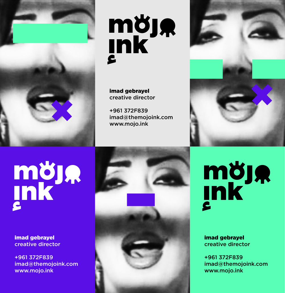
To reflect Mojo Ink’s commitment to advancing different areas of the creative industries in the Arab world, the Mojo Ink brand was designed as an example of participatory design, using a culturally-relevant approach without perpetuating stereotypes or exotic representations of local Arab cultures. The Mojo Ink brand is a versatile container for a large pool of visions, skills, expertise and productions. It offers a playful room for incubating experimental projects in type and communication design.
As creative director of Mojo Ink since 2013, I, together with a team of talented designers, combine our disparate skills in collective harmony to design highly successful visual and experiential communication projects for private and public sector clients across the Arab region. Operating between Abu Dhabi and Beirut, the agency leads by purpose and strongly believes in breaking boundaries, reimagining spaces and collaborating with like-minded creative thinkers.
Credits:
Projects Manager: Sandra Khoury-Flouti
Creative Director: Imad Gebrayel
Design Team: Sayed Kammoun, Carole Kaakour and Jo Sahyouni
Arabic Copywriter: Ridab Youssef
Web Development: Christopher Mally
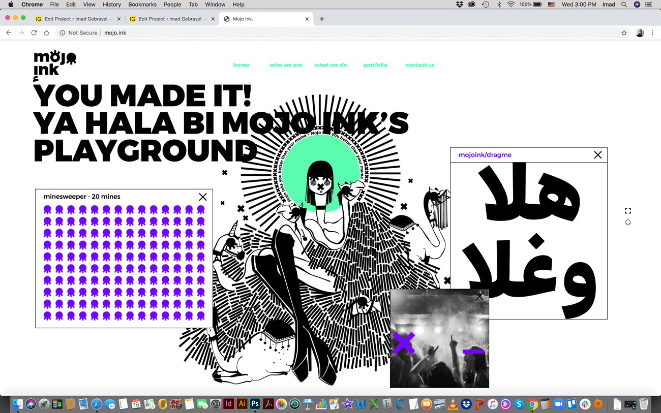
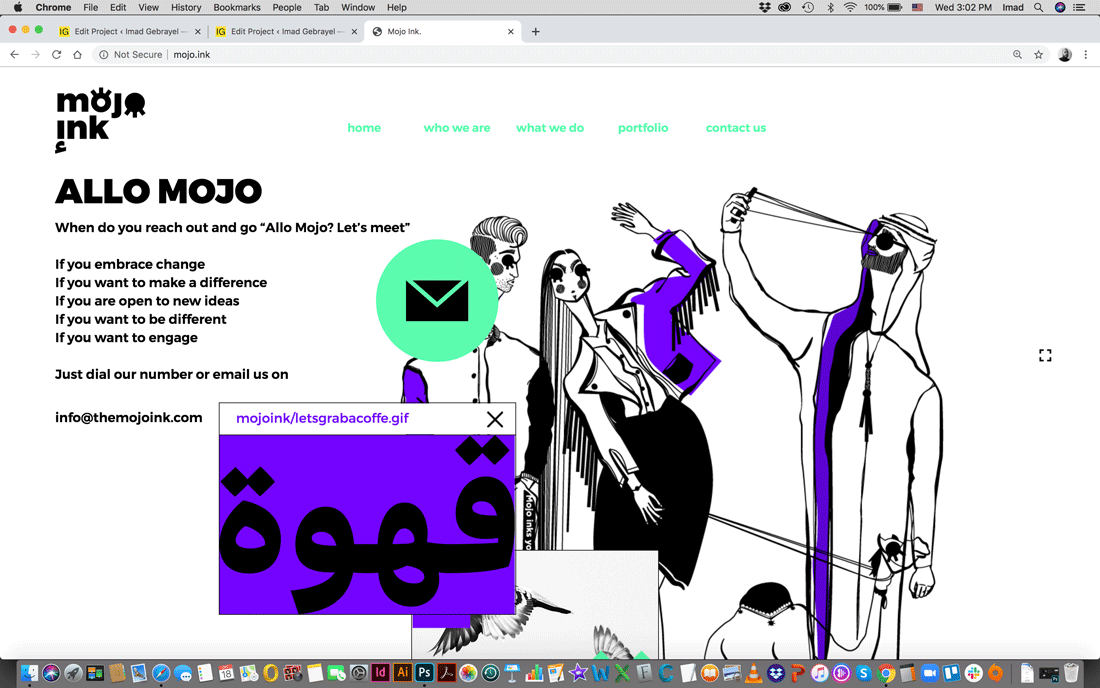
The Mojo Ink website is designed as a digital playground combining elements of nostalgia, illustration, gaming and locality.
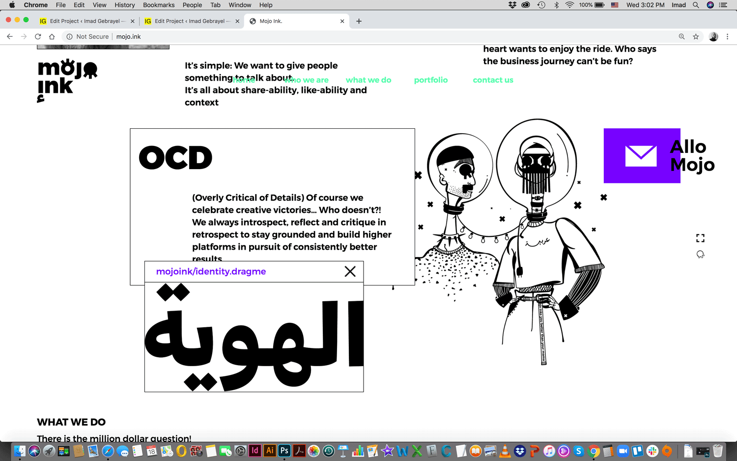
The website has multiple floating elements, adding to the personalized user experience: visitors can make their own grids.
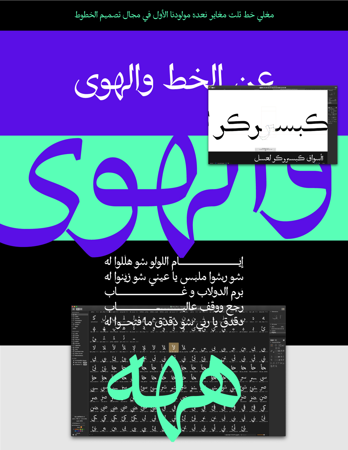
Meghli is a contrasted Tuluth font, born out of an experiment and responding to a lack of Tuluth fonts found in the digital realm. Typeface Design: Sayed Kammoun.
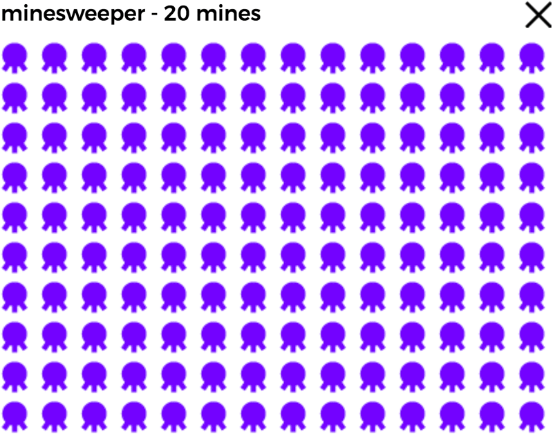
A custom-developed minesweeper is a fun addition to the homepage, inviting the user to come back for more.
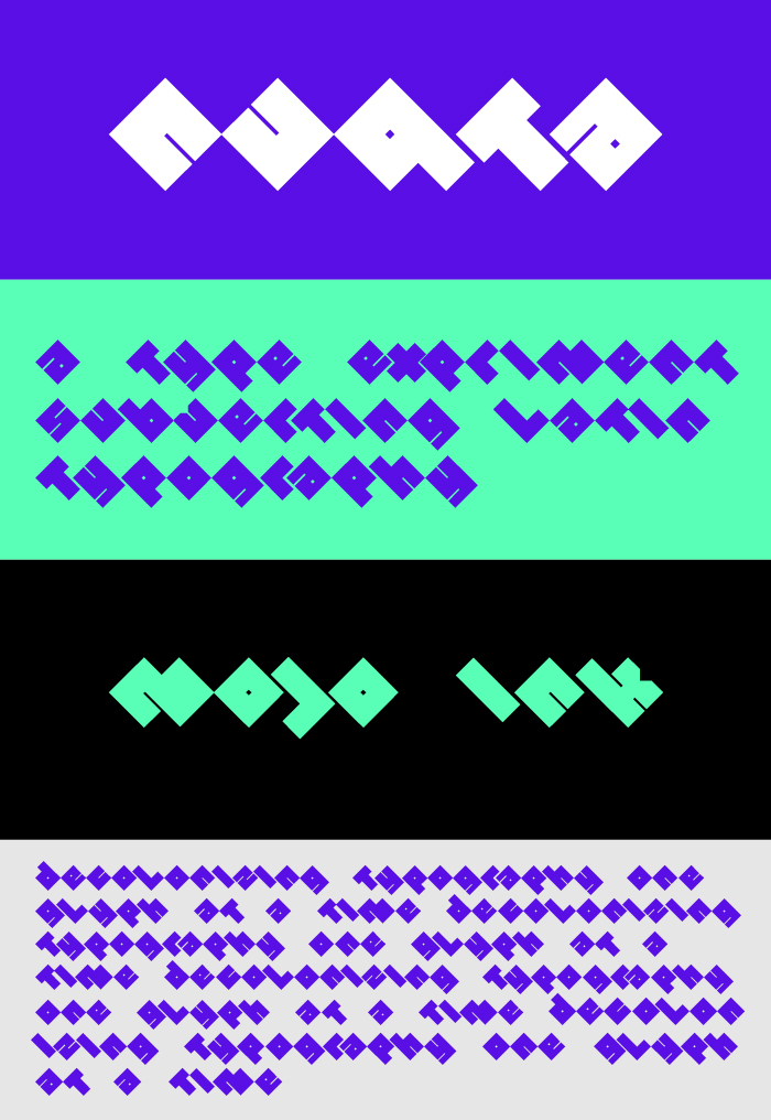
Nuqta is a Custom latin font based on the dot element of the Arabic script. This display typeface accustoms latin letters to rotated square shapes standing on a single-point baseline and challenging the political hegemony of latin type design. The system similar to codes and encryptions, creates a visually unique approach to display typography and locality. Typeface Design: Sayed Kammoun.
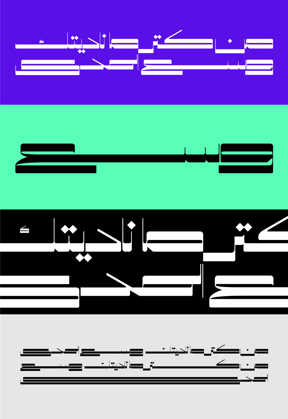
Mada is an Arabic typeface exploring the idea of extension and elongation. While latin typefaces of the sort are widely available, Arabic still lacks exaggerated display experiments with extended variations. Mojo Ink provides room for such experiments stemming from type design rules and conventions but challenging functionality as an obstacle facing the evolution of the design discipline. Typeface Design: Sayed Kammoun.

https://www.imadgebrayel.com/wp-content/uploads/2019/12/Imad_Gebrayel_Mojo_Ink_1.gif
https://www.imadgebrayel.com/wp-content/uploads/2019/12/Imad_Gebrayel_Mojo_Ink_3.gif
https://www.imadgebrayel.com/wp-content/uploads/2019/12/Imad_Gebrayel_Mojo_Ink_3-1.gif
https://www.imadgebrayel.com/wp-content/uploads/2019/12/Imad_Gebrayel_Sayed_Kammoun_Meghli-1.jpg
https://www.imadgebrayel.com/wp-content/uploads/2019/12/Imad_Gebrayel_MojoInk.jpg
https://www.imadgebrayel.com/wp-content/uploads/2019/12/Imad_Gebrayel_Mojo_Ink_6.gif
https://www.imadgebrayel.com/wp-content/uploads/2019/12/Imad_Gebrayel_Sayed_Kammoun_Nuqta.jpg
https://www.imadgebrayel.com/wp-content/uploads/2019/12/Imad_Gebrayel_Sayed_Kammoun_Mada.jpg

Mojo Ink – The Brand
2018
Abu Dhabi (UAE)
Branding
A creative agency leading by culturally relevant design and purposeful communication.
To reflect Mojo Ink’s commitment to advancing different areas of the creative industries in the Arab world, the Mojo Ink brand was designed as an example of participatory design, using a culturally-relevant approach without perpetuating stereotypes or exotic representations of local Arab cultures. The Mojo Ink brand is a versatile container for a large pool of visions, skills, expertise and productions. It offers a playful room for incubating experimental projects in type and communication design.
As creative director of Mojo Ink since 2013, I, together with a team of talented designers, combine our disparate skills in collective harmony to design highly successful visual and experiential communication projects for private and public sector clients across the Arab region. Operating between Abu Dhabi and Beirut, the agency leads by purpose and strongly believes in breaking boundaries, reimagining spaces and collaborating with like-minded creative thinkers.
Credits:
Projects Manager: Sandra Khoury-Flouti
Creative Director: Imad Gebrayel
Design Team: Sayed Kammoun, Carole Kaakour and Jo Sahyouni
Arabic Copywriter: Ridab Youssef
Web Development: Christopher Mally

The Mojo Ink website is designed as a digital playground combining elements of nostalgia, illustration, gaming and locality.
The website has multiple floating elements, adding to the personalized user experience: the visitor can make his own layout
A custom-developed minesweeper is a fun addition to the homepage, inviting the user to come back for more.
Meghli is a contrasted Tuluth font, born out of an experiment and responding to a lack of Tuluth fonts found in the digital realm. Typeface Design: Sayed Kammoun.
Nuqta is a Custom latin font based on the dot element of the Arabic script. This display typeface accustoms latin letters to rotated square shapes standing on a single-point baseline and challenging the political hegemony of latin type design. The system similar to codes and encryptions, creates a visually unique approach to display typography and locality. Typeface Design: Sayed Kammoun.