Mapping The News
2015
Breda (NL)
Information Design
In November 2015, terrorist attacks in Lebanon resulted in casualties of 43 dead and 240 wounded with ISIS claiming responsibility. The day after, a series of coordinated attacks in Paris killed 130 people and 368 people were injured.
In an analysis of international coverage on the attacks in Lebanon, benchmarked against news of the Paris explosions, journalistic bias was evident in the context, scale and frequency. A closer study of the newspaper articles confirmed the intrinsic link between media reporting and their political agendas.
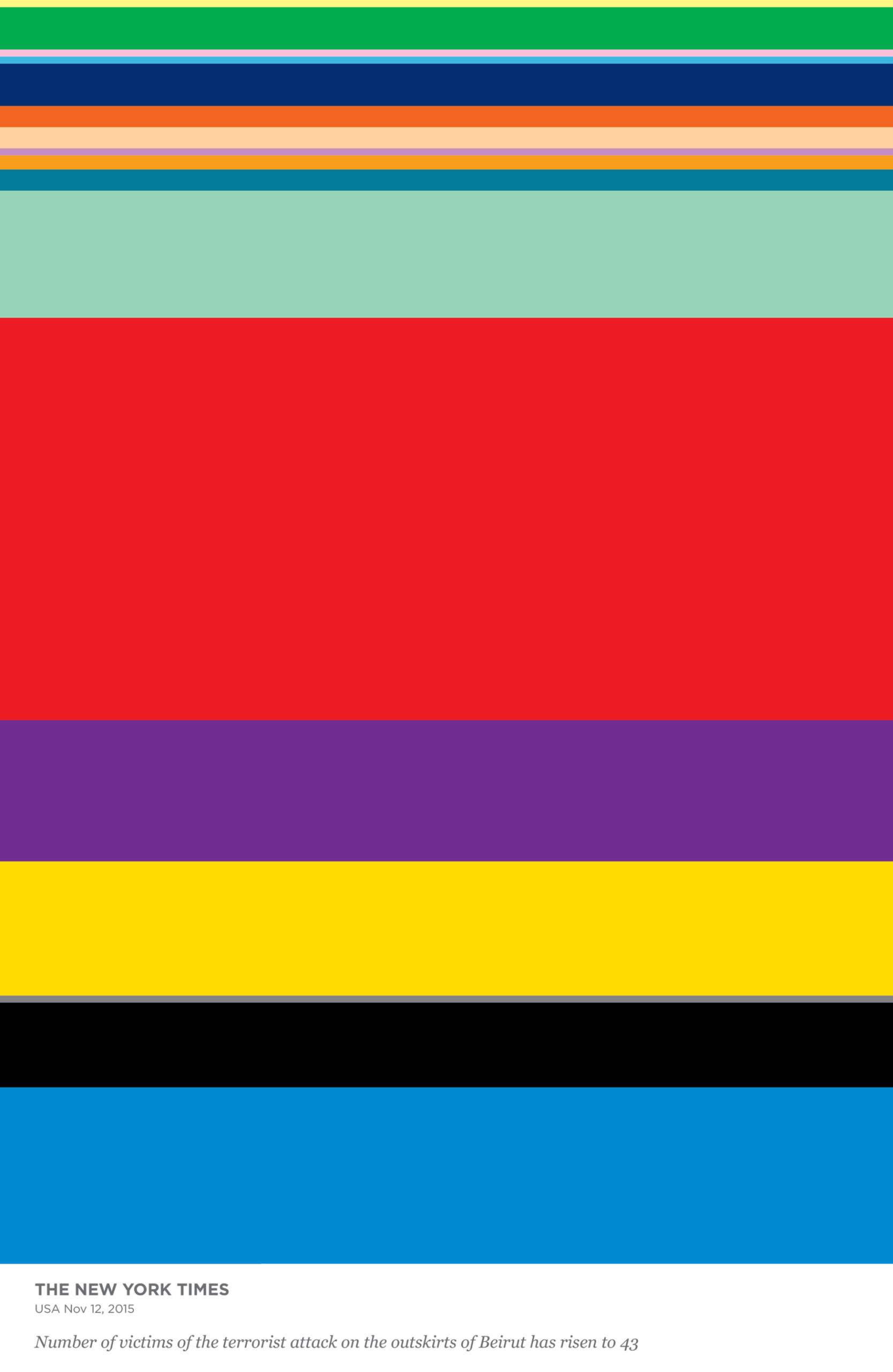
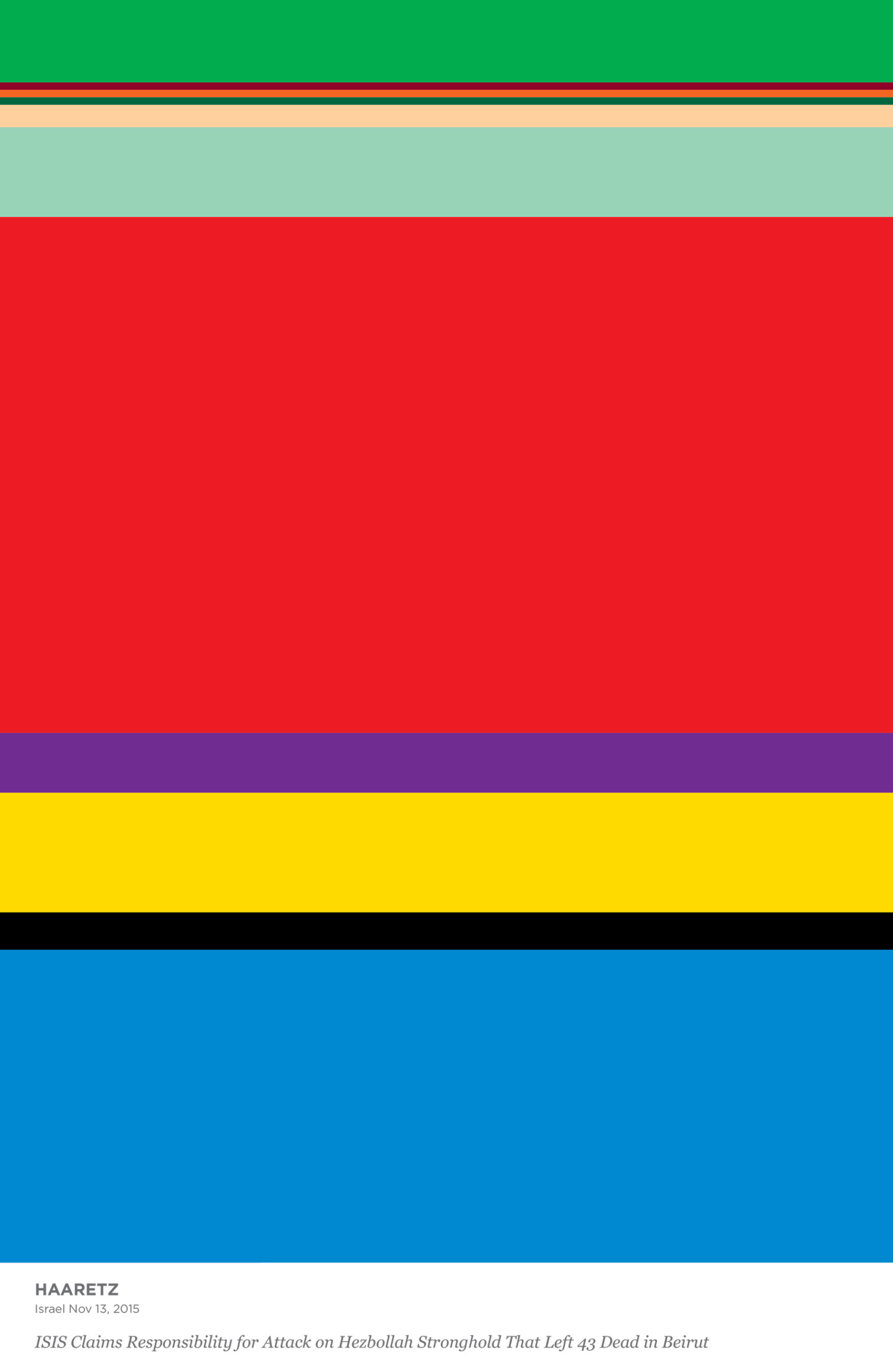
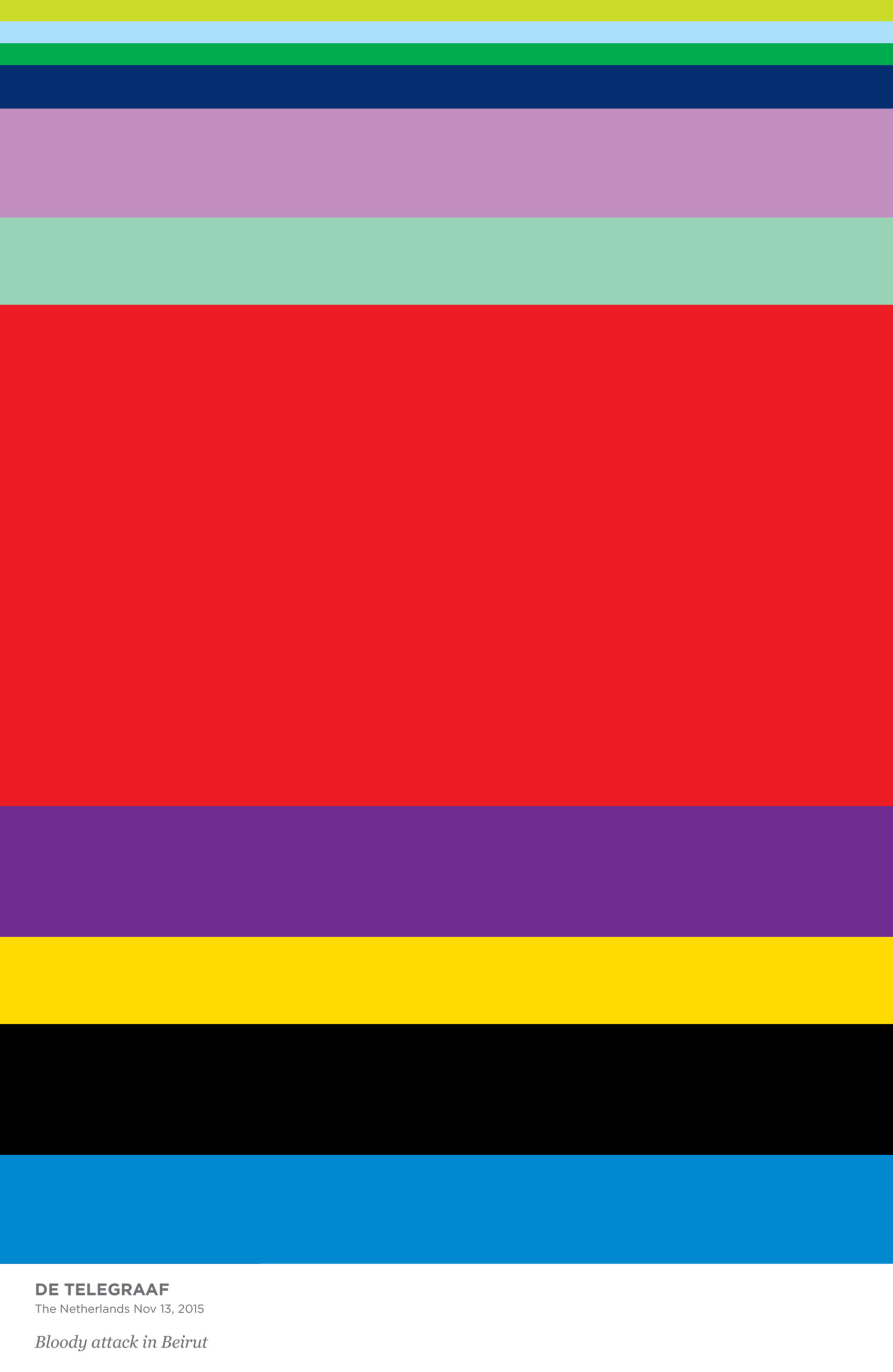
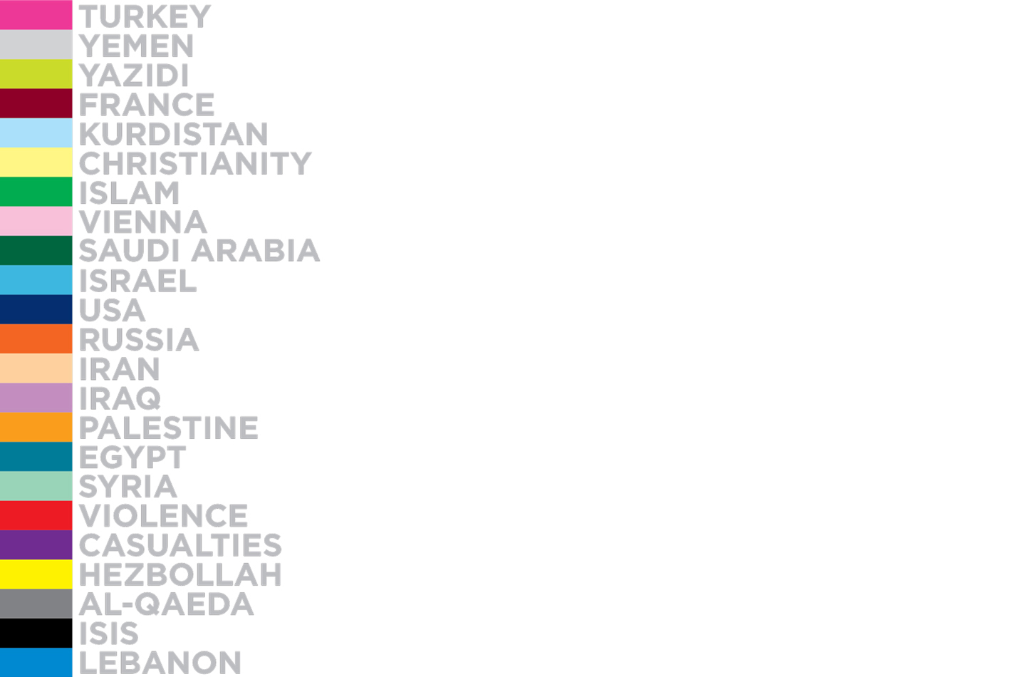
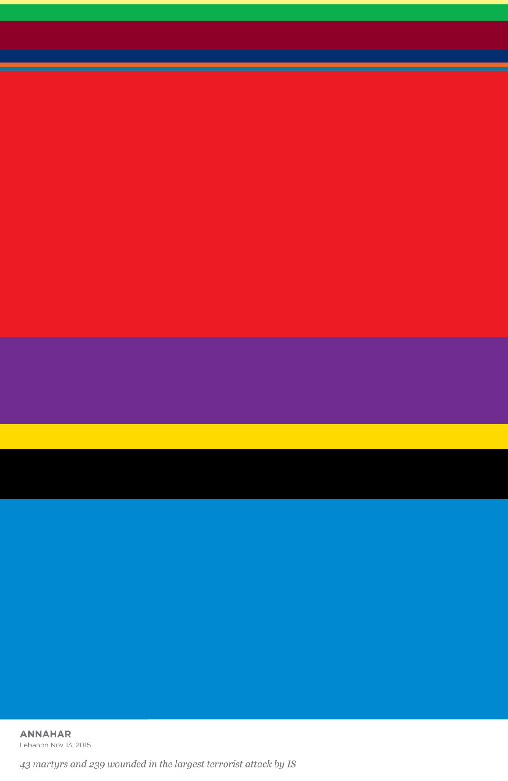
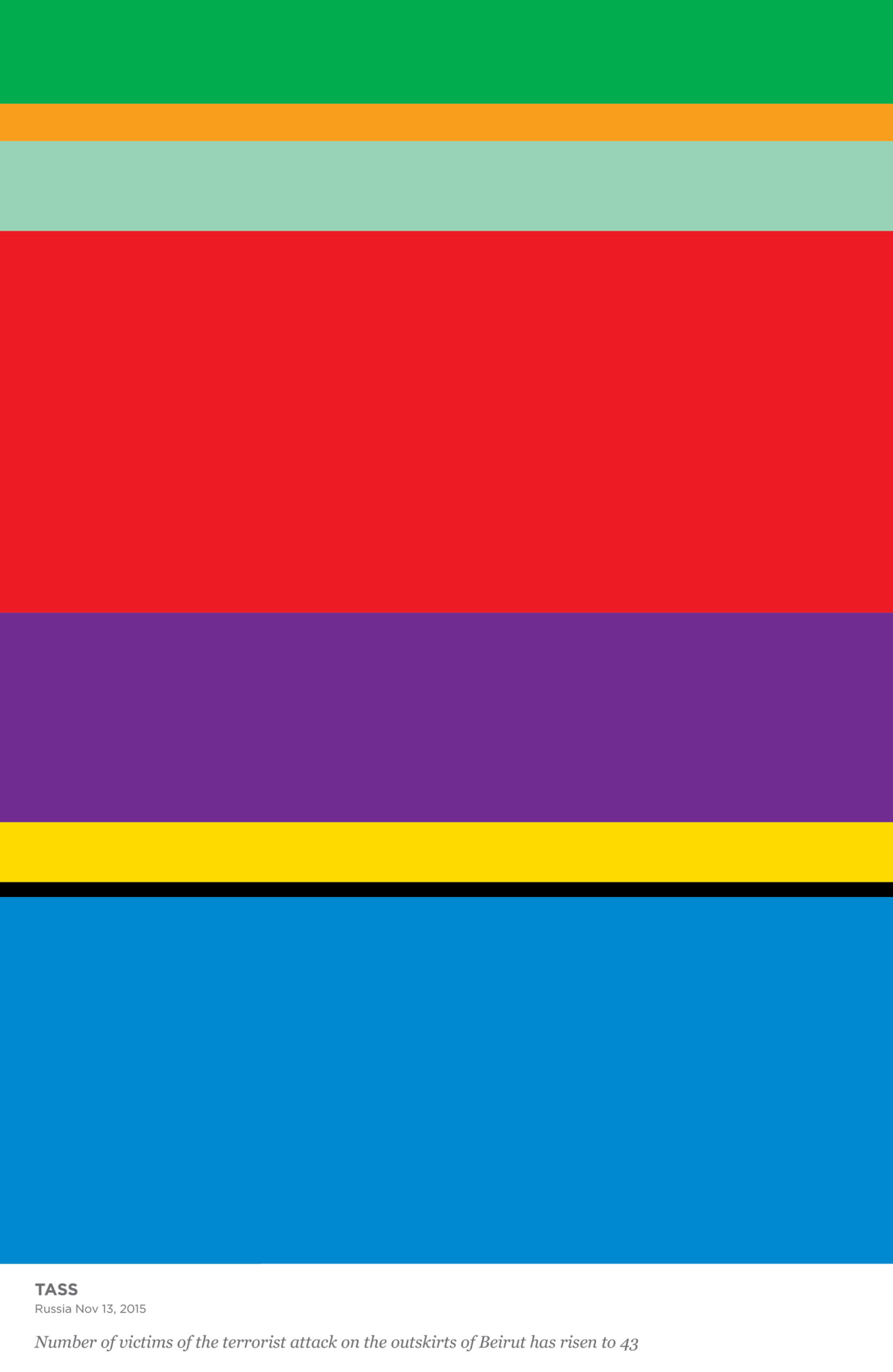
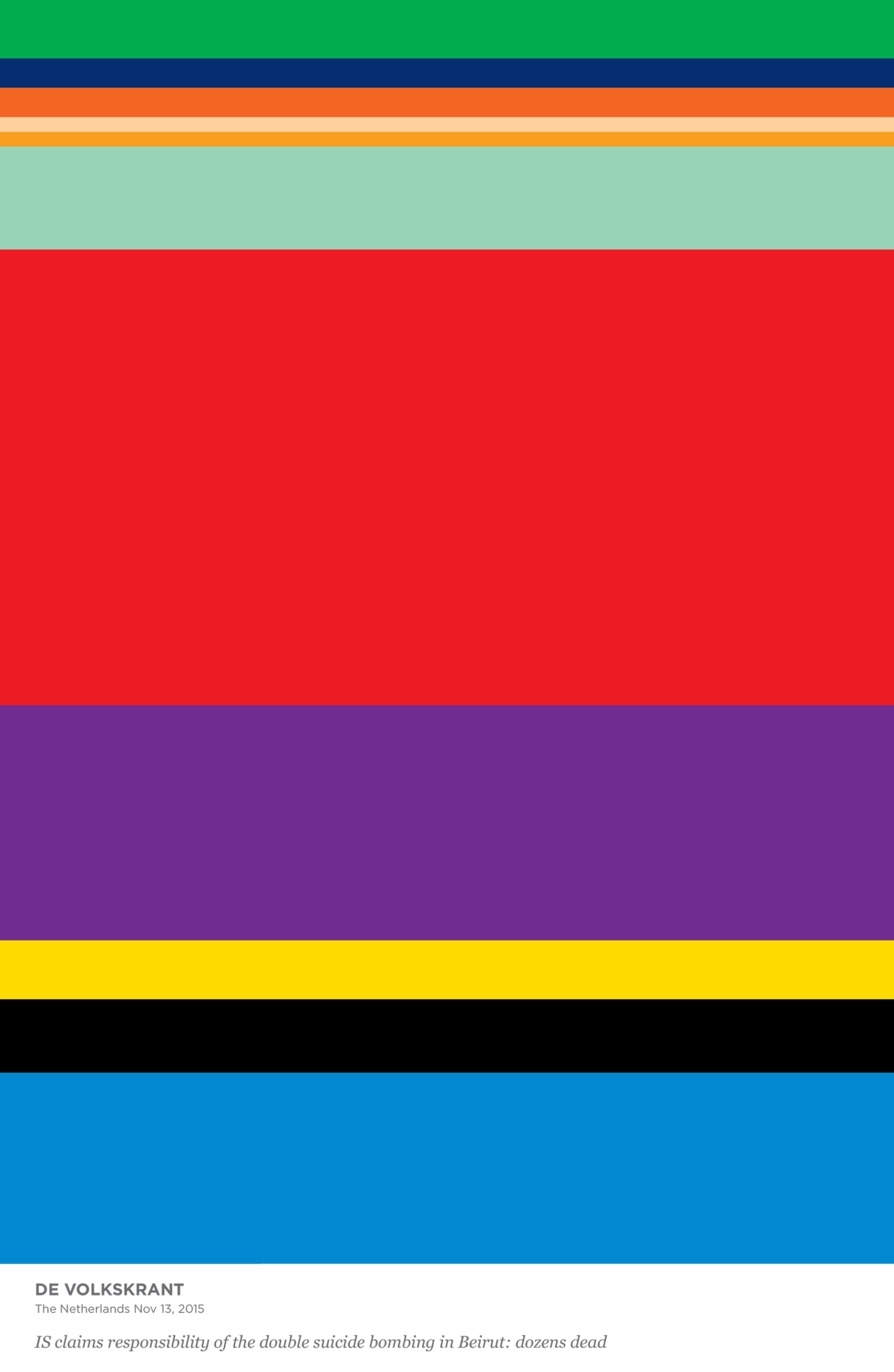
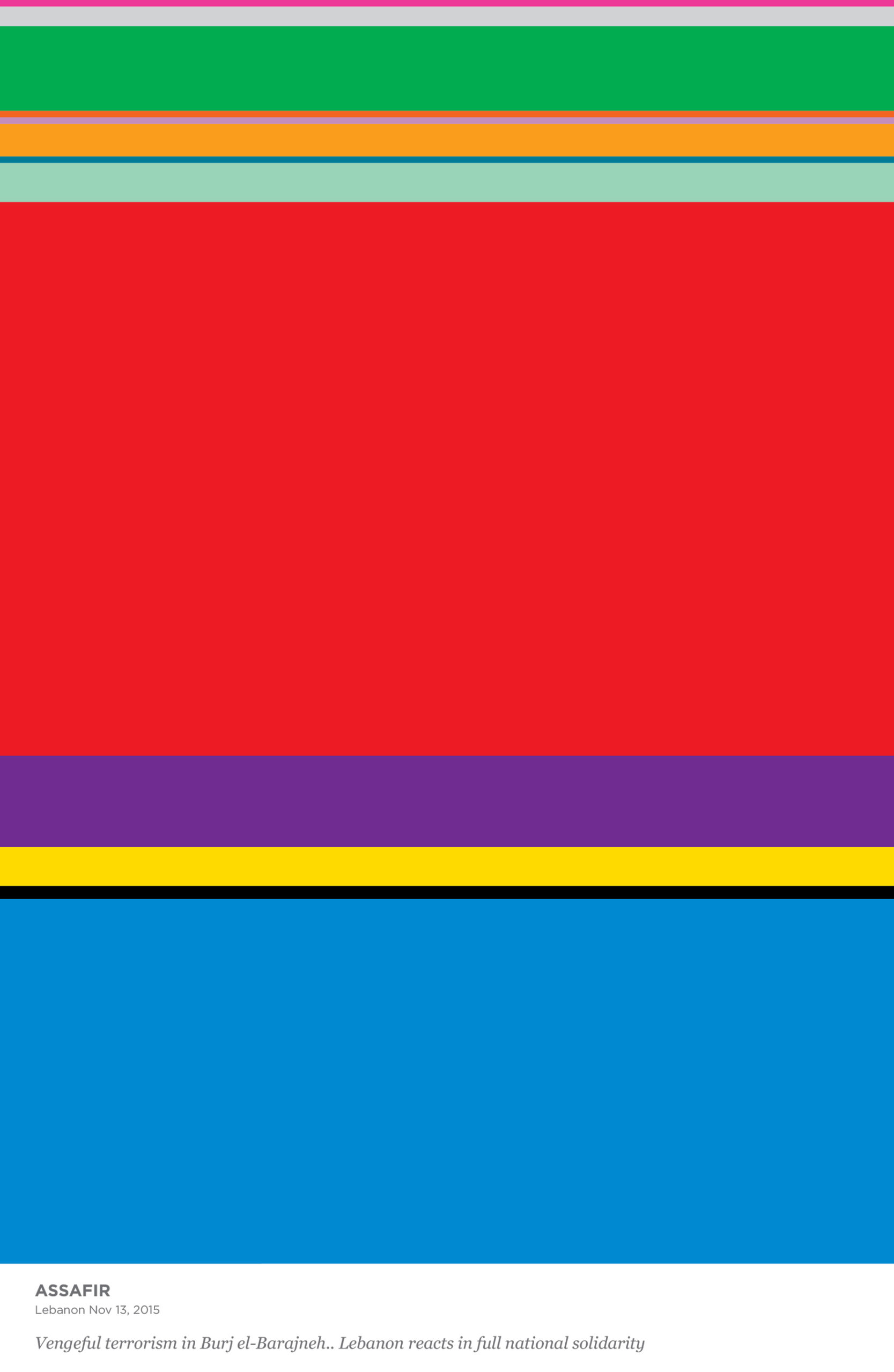
I analyzed 8 articles from 8 international newspapers covering the attack on Beirut to produce a data-based visual experiment entitled ‘Mapping the News’ . Each article was linguistically dissected and placed into 23 categories focused on the vocabulary of violence, death, country, religion and other recurrent words. An analysis then visualization of the data saw the charts scaled into posters that transformed the written journalistic articles into a data-driven abstract visual narrative.
A linear placement of the posters implored a person to question media filters: why does the Israeli Haaretz mention Hizbullah more than ISIS? Why does Lebanon’s right-wing Annahar extensively mention ‘France’ and why is the Dutch ‘De Telegraf’ linking its vocabulary to Iraq while ‘De Volkskrant’ avoids the connection?
By unravelling the hidden layers of news coverage through data visualization, my work at the intersection of journalism and design illustrates the unequivocal bias inherent in today’s media.
The project was designed during the Master of Graphic Design programme – AKV|St.Joost – Breda, The Netherlands, 2015.


https://www.imadgebrayel.com/wp-content/uploads/2019/11/Imad_Gebrael_PlayReplay_Dec25-1-scaled.jpg
https://www.imadgebrayel.com/wp-content/uploads/2019/11/Imad_Gebrael_PlayReplay_Dec25-3-scaled.jpg
https://www.imadgebrayel.com/wp-content/uploads/2019/11/Imad_Gebrael_PlayReplay_Dec25-5-scaled.jpg
https://www.imadgebrayel.com/wp-content/uploads/2019/11/Imad_Gebrael_PlayReplay_Dec25-9-1.jpg
https://www.imadgebrayel.com/wp-content/uploads/2019/11/Imad_Gebrael_PlayReplay_key.jpg
https://www.imadgebrayel.com/wp-content/uploads/2019/11/Imad_Gebrael_PlayReplay_Dec25-2-scaled.jpg
https://www.imadgebrayel.com/wp-content/uploads/2019/11/Imad_Gebrael_PlayReplay_Dec25-4-scaled.jpg
https://www.imadgebrayel.com/wp-content/uploads/2019/11/Imad_Gebrael_PlayReplay_Dec25-6-scaled.jpg
https://www.imadgebrayel.com/wp-content/uploads/2019/11/Imad_Gebrael_PlayReplay_Dec25-7-scaled.jpg

Mapping The News
2015
Breda (NL)
Information Design
A comparative between political agenda and news coverage. Research-led visualizations of trends resulting from political news analysis in the subsequent terrorism attacks of November 2015. This project was then transformed into a news-visualization workshop format.
In November 2015, terrorist attacks in Lebanon resulted in casualties of 43 dead and 240 wounded with ISIS claiming responsibility. The day after, a series of coordinated attacks in Paris killed 130 people and 368 people were injured.
In an analysis of international coverage on the attacks in Lebanon, benchmarked against news of the Paris explosions, journalistic bias was evident in the context, scale and frequency. A closer study of the newspaper articles confirmed the intrinsic link between media reporting and their political agendas.
I analyzed 8 articles from 8 international newspapers covering the attack on Beirut to produce a data-based visual experiment entitled ‘Mapping the News’ . Each article was linguistically dissected and placed into 23 categories focused on the vocabulary of violence, death, country, religion and other recurrent words. An analysis then visualization of the data saw the charts scaled into posters that transformed the written journalistic articles into a data-driven abstract visual narrative.
A linear placement of the posters implored a person to question media filters: why does the Israeli Haaretz mention Hizbullah more than ISIS? Why does Lebanon’s right-wing Annahar extensively mention ‘France’ and why is the Dutch ‘De Telegraf’ linking its vocabulary to Iraq while ‘De Volkskrant’ avoids the connection?
By unravelling the hidden layers of news coverage through data visualization, my work at the intersection of journalism and design illustrates the unequivocal bias inherent in today’s media.
The project was designed during the Master of Graphic Design programme – AKV|St.Joost – Breda, The Netherlands, 2015.